Joyful Essentials
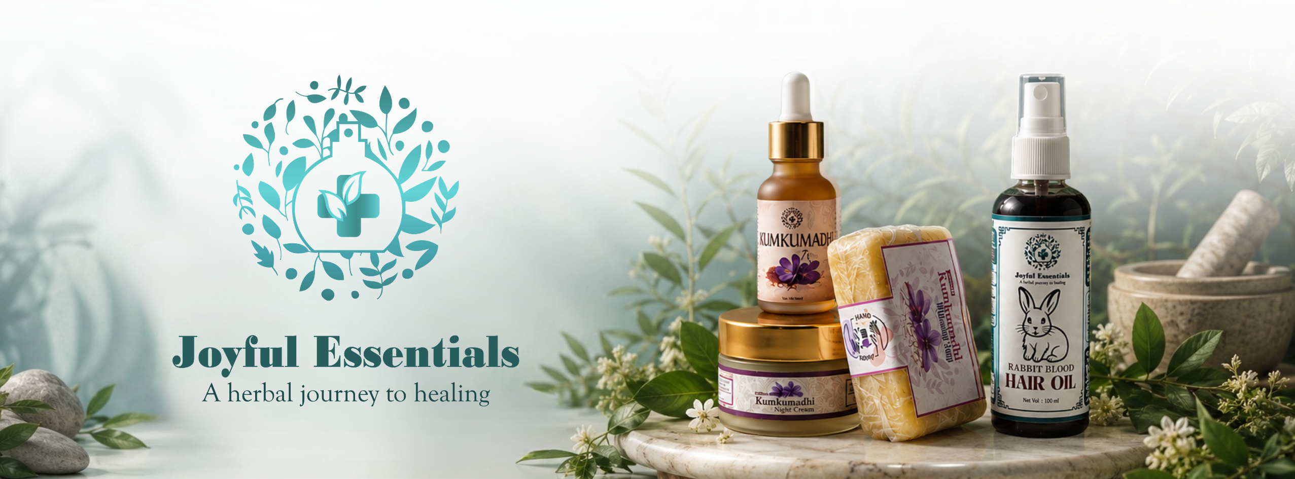
A holistic wellness brand in Nelliady, Jaffna, with label and packaging design rooted in Ayurvedic and Siddha traditions.
Client
Joyful Essentials
Industry
Wellness
Location
 Nelliady, Jaffna, Sri Lanka
Year
2025
2025
Project year
Ongoing
Label & packaging partnership
The Context
Joyful Essentials, founded by Dr. Shamande Nithiyananthan, is a holistic wellness brand based in Nelliady, Jaffna. Rooted in Ayurvedic and Siddha traditions, the brand offers natural herbal products and consultations that target overall wellbeing.
As they prepare to expand their audience with a new website, the packaging and labels must effectively convey trust, authenticity, and their rich heritage.
Problems & Goals
Joyful Essentials had the expertise and product quality but lacked a strong visual identity to effectively reach consumers. Several gaps needed to be addressed:
Natural herbal products need to visually convey purity, expertise, and safety at a glance.
- Inconsistent labeling, Products did not have cohesive, professional labels that create a unified brand identity.
- Trust gap on shelf, Natural herbal products need to visually convey purity, expertise, and safety at a glance.
- Heritage vs. modernity, Ayurvedic and Siddha roots must be communicated without making products feel outdated or inaccessible.
- Scalable packaging, A design system should adapt across various product types and sizes as the product range expands.
Our Direction
We viewed this project as more than just a labeling exercise; it was an opportunity to build a brand. Our goal was to create a visual language that respects the richness of traditional medicine while delivering it in a clear and confident way that today’s conscious consumers expect.
The Transformation
Roots, made visible
We drew inspiration from botanical illustration traditions and Ayurvedic iconography to create visual anchors that feel both timeless and refined.
Clarity as trust
Label layouts are structured to highlight key information such as the product name, main ingredient, and usage, without any visual clutter.
Colour that communicates
A color palette inspired by nature, warm creams, botanical greens, and muted terracotta, reinforced the brand’s herbal and wholesome character.
Built to grow with
All design decisions were made considering the entire product range, ensuring that new additions can be incorporated without requiring a redesign.
Tools Used
Adobe Illustrator was used for label and packaging design development, ensuring precision in layout, typography, and scalability across product variations. Adobe Photoshop supported mock-ups and visual presentations, helping visualize the packaging in real-world contexts.
Together, these pillars established a scalable packaging system that grows with Joyful Essentials’ product range.
The Outcome
The collaboration with Joyful Essentials continues through the ongoing development of product labels and packaging designs that strengthen the brand’s presence across its growing product range. Each design is carefully crafted to reflect the brand’s values of tradition, care, and quality while maintaining consistency and visual appeal.
As the product line expands, the evolving packaging system ensures a cohesive and recognizable brand identity that resonates with wellness-conscious consumers.
In parallel, the Joyful Essentials website is currently under construction, with the same visual language and brand principles being carried into the digital experience to create a seamless connection between packaging and online presence.
Through this ongoing partnership, Joyful Essentials continues to build a professional, trustworthy, and distinctive presence in the market, positioning the brand for sustained growth across both physical and digital touchpoints.
Conclusion
Joyful Essentials now has a packaging system that honours Ayurvedic and Siddha heritage while speaking clearly to modern wellness consumers.
At Techloom.ai, we are proud to support their ongoing growth, from shelf to site, as the brand scales with consistency, trust, and distinction.